

How to Use BirdCast Dashboard to See Your Local Migration in Detail
By Hugh Powell
April 20, 2022
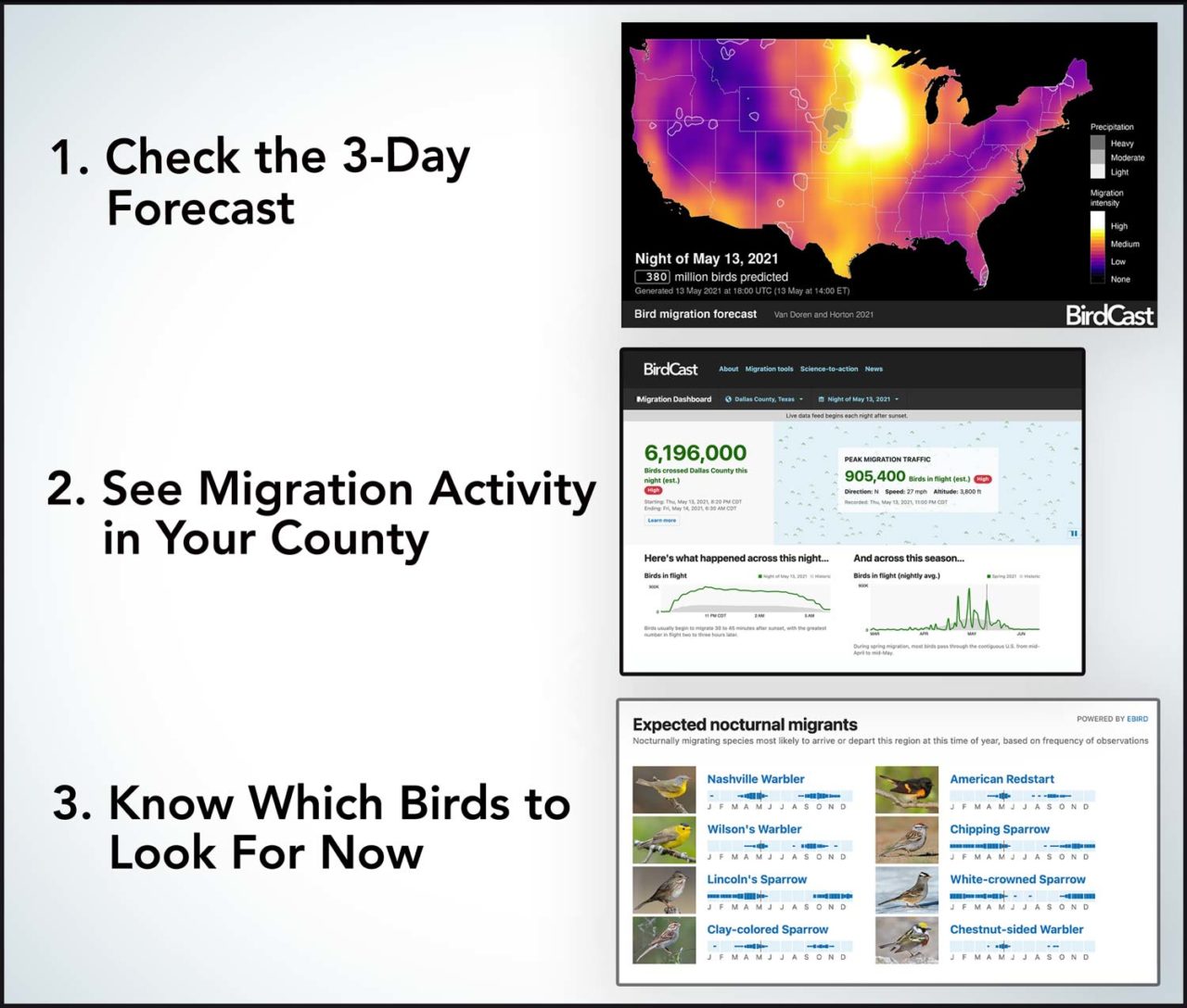
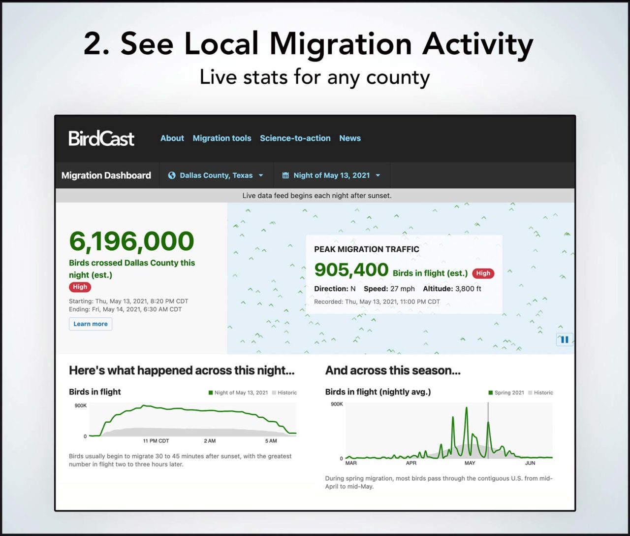
3 Steps to Better Migration Birding: Check the forecast, drill down to see your county's activity, and be prepared with a list of likely species to see. Click through the slideshow for more on how to use the powerful new tools from BirdCast. BirdCast creates 3-day forecasts of migration activity for the Lower 48. Brighter colors indicate more bird traffic. Gray areas show weather fronts that may disrupt migration. Check Migration Dashboard to see migration estimates for any county or state in the Lower 48. This example image shows more than 6 million migrants passed over a single Texas county the night of May 13, 2021 (green numbers and lines), far more than on a typical migration night (gray curves). By tapping into eBird data, Migration Dashboard suggests the bird species most likely to be arriving or departing the selected county on the selected date—giving you a short list of highlight species to look for.


Originally published April 2018; updated April 2022. This article also appeared in the Spring 2019 issue of Living Bird magazine. Subscribe now.
Migration is the best time to be a birdwatcher. Twice a year, hordes of birds fly thousands of miles through the night to grace your home turf for a few days or weeks. But they don’t come in a steady convoy—it’s more like a stuttering stream of flurries and pauses. That’s why even during peak migration, some days are quiet while others are packed with new arrivals.
Birders have for decades tried to guess which nights would be big ones for migration, and that effort took a huge step forward in 2018 when BirdCast introduced 3-day migration forecasts for the Lower 48 states. Now, in spring of 2022, the project has released a major expansion called Migration Dashboard that allows you to see actual migration patterns all the way down to state and county levels—an unprecedented scale of resolution.
In essence, BirdCast boils down decades of migration science and couples it with real-time radar data to create a powerful suite of tools:
- 3-day migration forecast for the Lower 48 states
- continental map of migration activity
- estimates of total migration traffic, direction, speed, and more, for any county or state in the contiguous U.S.
- lists of likely species arriving now in your area
- local migration alerts when waves of migrants are on their way
- you can even go back in time to check data from past nights
With so many new options, we checked in with BirdCast’s Adriaan Dokter, a research associate at the Cornell Lab, and Kyle Horton, of Colorado State University, for some pointers on how to make the most of Migration Dashboard:
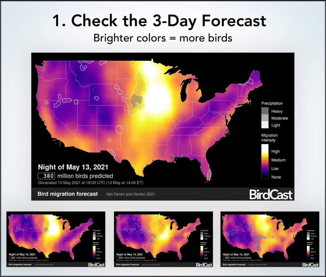
First, Check the 3-Day Forecast
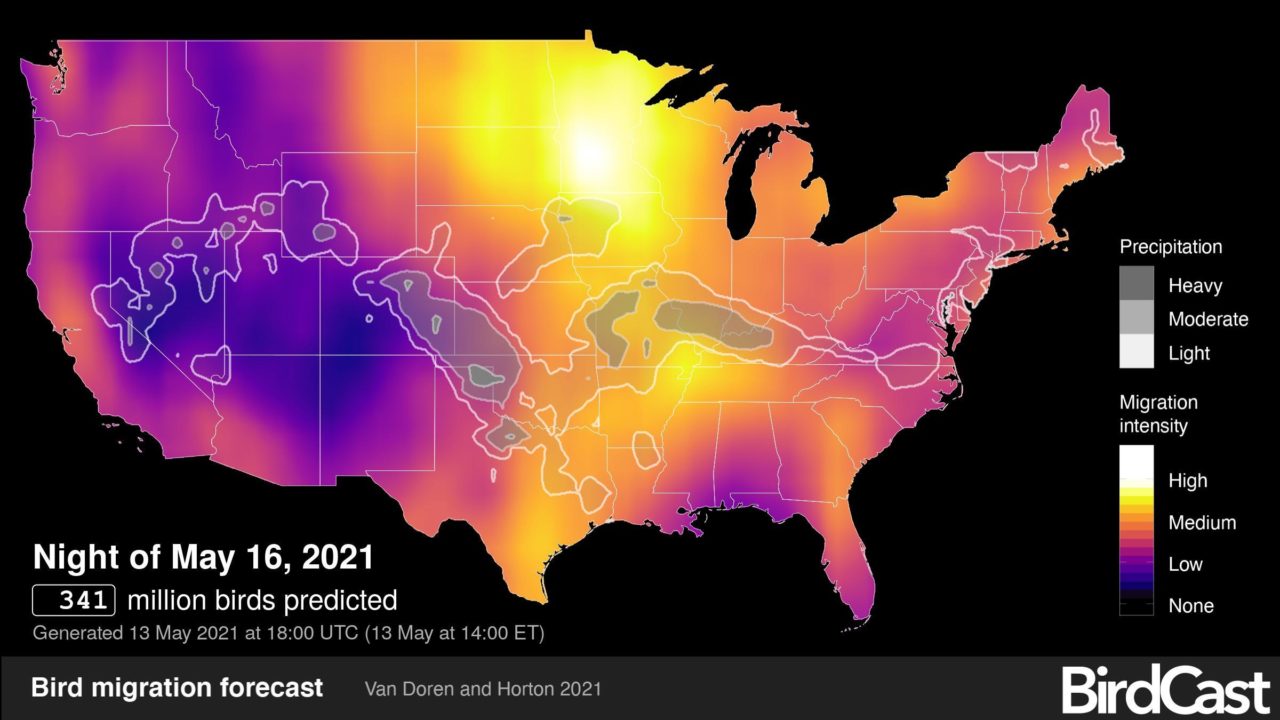
That large, colorful map at the top of the BirdCast homepage shows the forecast for tonight’s migration. Below it you’ll see thumbnails of predictions for the next three nights (click or tap to see full images). Casting your eye over these maps will give you an idea of how the next few nights are shaping up. The maps are produced by BirdCast’s Benjamin Van Doren, a postdoctoral fellow at the Cornell Lab, and Horton.
The magic of the forecast maps is that they compile more than 25 years of data on when migrants are on the move and mash it up with meteorological data including wind speed, direction, barometric pressure, and temperature. You no longer have to have a PhD in migration ecology to use all these variables: just look for the brightest colors on the maps to know when to go.
Next, See Local Migration Activity in Your County
Like all forecasts, a migration forecast is a prediction based on computer models—it’s not always right. Click over to Migration Dashboard to see how migration is playing out each night, or check it in the morning for a summary before you head out for birdwatching.
The amazing thing about Migration Dashboard is that it’s able to compute an estimate of migration traffic for every county in the Lower 48 states. Just enter your county or state in the top search bar to bring up your local results. Frankly, we think it’s mind-blowing to see just how many birds are in the air over a single county on any given night.
And if you’re fascinated by the details of migration, Dashboard tells you the birds’ average speed, direction, and altitude—and compares these stats to historical patterns, all on one screen.
Migration Dashboard uses data from 143 radar stations that update every 30 minutes, compiling about 100 gigabytes of data every night via an algorithm designed by Dokter.
You can check migration stats during the night—they’re refreshed every 10 minutes—or look at them first thing in the morning to get an idea of where to go birdwatching. To see stats for previous nights, just select a different date at the top of the screen.
You can also see an animated map of migration traffic for the whole Lower 48 and play back the night’s activity, for any date in the BirdCast database. Controls on the player let you pause, rewind, speed up, slow down, or advance the playback one frame at a time.
And don’t worry that you have to stay up till dawn obsessively refreshing the page for the latest data (unless you want to, of course). Migration flights typically peak a few hours after sunset, so if it looks good at 10 p.m., it will probably still be good in the morning.
Want to get advance notice for when heavy nights of migration are approaching? Check BirdCast’s local migration alerts for any city in the Lower 48.
Know Which Birds to Look For
One limitation of radar data is it can’t identify which species are migrating—one of the top questions a migration-obsessed birder might have. Migration Dashboard addresses this problem by tapping into the vast eBird database. Using thousands of local eBird checklists, the tool compiles information on migration timing and presents a list of the bird species most likely to be arriving or departing your area on any given night.
The End Goal? Conservation
These new tools are a gift to birdwatchers looking to fine-tune their birding schedule—but Horton, Dokter, and the rest of the BirdCast team have a bigger goal. By creating accurate forecasts and up-to-the-minute monitoring data, they hope to provide tools for managing wind turbines and city lights. Collisions with lighted windows (and, to a lesser extent, wind turbines) are a major cause of bird death. But the majority of migrants come through on a few nights each year, meaning that fairly easy adjustments including turning out nonessential lighting and making windows safer could save huge numbers of birds.
Fine Print
The BirdCast maps make the most of the available data and models, and have undergone significant testing. Still, Horton and Dokter outlined a few caveats to bear in mind as you start to use the maps.
- Coverage is limited to the U.S.—why? We agree, it would be great to extend these maps to Canada and Mexico, but the radar infrastructure and the real-time data connections don’t currently allow that.
- Migration strength is relative to the whole country. On the forecast map, migration activity is shown on a purple-orange-yellow scale. High-migration areas such as the Gulf Coast and the Mississippi Flyway will reliably turn yellow (or even white) during peak migration; but other parts of the country, such as the Rockies, will rarely show yellow, even on locally good nights, because they don’t reach the same level of activity.
- Bird numbers are approximate. The real time migration maps estimate activity in thousands of birds per kilometer. These numbers are based on songbird-sized birds—it’s possible that there could be smaller numbers of larger birds creating the same signal.
- Radar can’t tell bird species. Radar data can tell us a lot, but at the moment it can’t tell us which species are migrating. Migration Dashboard uses radar data to tell when birds are moving, and eBird data to give a best guess of which species are in the air.
- Flight direction is sometimes wrong. The flight direction arrows calculate an average direction for all the birds moving over a fairly large area—so sometimes they point in unexpected directions. They should be used as a general indication rather than a precise number.
- Watch for storms. Birds typically migrate during clear weather and drop to the ground when it starts raining. This means weather fronts can greatly alter migration activity at a local level. The 3-day forecast maps alert you to this by showing major weather systems in gray and black on the maps. Migrants may “fall out” en masse on the near side of a weather system, and be scarce on the far side the next morning.
All About Birds
is a free resource
Available for everyone,
funded by donors like you
American Kestrel by Blair Dudeck / Macaulay Library