

Beyond Range Maps: New eBird Maps Reveal Bird Abundance and Movements
By Hugh Powell and Kathi Borgmann
February 15, 2020


Update Feb 2020: eBird Science data products are now available for 610 U.S. and Canada species, and for wide-ranging species the maps have been expanded to include both North and South America. Read more about this major update.
This article was originally published in the Spring 2019 issue of Living Bird magazine, and an updated version appeared in the Spring 2020 issue. Subscribe now. The data products, originally termed eBird Status and Trends, are now referred to as eBird Science.
In 2018, eBird introduced a new class of maps that show where North American birds are at a finer scale than has ever been possible before. In 2020, the team rolled out a major update that expands coverage to 610 species. Using sightings from more than 10 million eBird checklists and satellite data from NASA, the new eBird Science analyses take the idea of a field guide range map and supercharge it—using data and models to estimate bird abundance every week of the year across the Americas.
The result is a pointillist illustration of a bird’s range that can be animated, creating a captivating, fluid portrait of where a species goes throughout its annual cycle.
In 2015 we wrote, “Today’s maps are made of ink and paper, but tomorrow’s maps will be made of pixels and data.” And today, that’s the era that eBird Science ushers in. Suddenly a range map doesn’t have to be based on a single expert’s knowledge, drawn with opaque ink, and printed on a map the size of a postage stamp. It can be alive: driven by millions of data points, intricately detailed down to the county level and below, and moving to show the way birds move with the seasons.
View at eBird
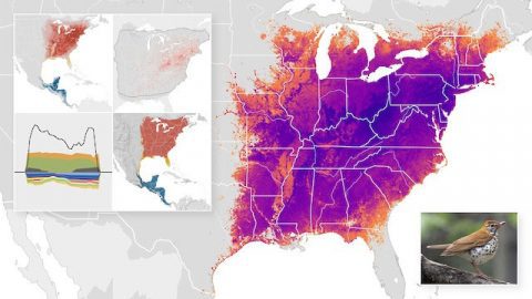
And these data products go far beyond range maps. They show abundance (not just occurrence), allowing birders, conservationists, and scientists to distinguish a species’ strongholds from areas where it’s scarce. The maps are created with models that include environmental data, which means eBird Science can also tell you which habitat types are best for finding a given species from week to week. And for a growing subset of species, the eBird team can even map a species’ population trends over the last decade—an especially difficult feat owing to the noisy nature of observational data. Look for trend data coming soon.
The project currently covers 610 North American species. All of the maps and animations are free for anyone to view (with a free Cornell Lab account you can even download them). The free access reflects eBird’s guiding principles: to collect data that the birdwatching public voluntarily provides, and transform it into products that benefit conservationists and scientists. Using eBird is a way for every birder on the planet to enjoy their hobby while making the world better for birds.
Scientists and land managers are the main audience for the new eBird Science data products—but the maps have a lot to offer bird watchers as well—from understanding distributions to pinpointing population trends at a truly local scale. Let’s take a closer look at some of the main products:
Abundance maps by season
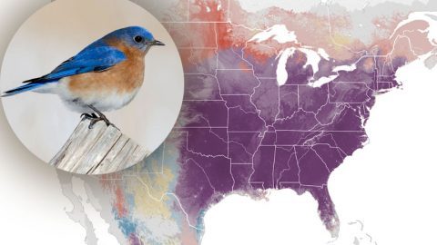
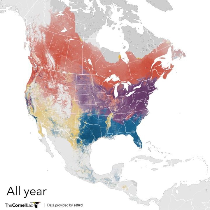
The very fine spatial resolution of the eBird models produces maps that look like conventional range maps but contain far more information. For instance, in this year-round map for Cedar Waxwings, it’s immediately clear that the species is much more numerous in eastern North America than in the interior West. This distinction isn’t visible in a standard field guide range map.

Cedar Waxwings are common across much of North America. They winter across the southern U.S. (blue) and move into northern Canada in the breeding season (red). Darker shades show regions where Cedar Waxwings are more abundant. See the full set of Cedar Waxwing data products and maps. Cedar Waxwing by Darren Clark/Macaulay Library.

The above year-round map can be broken out to show the four seasons separately. Again, the pointillism of the abundance estimates draws attention to subtle features, such as the relative scarcity of Cedar Waxwings in the Upper Midwest in winter; and higher numbers in the center of the continent during spring migration than during fall.
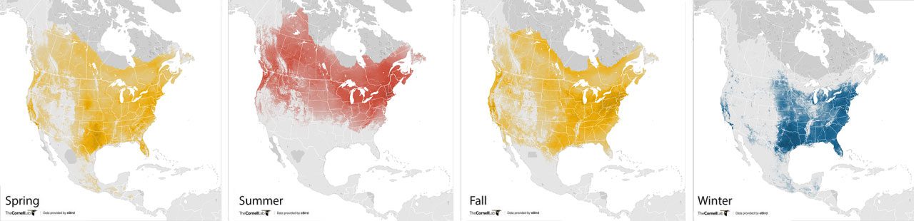
All of these maps can be downloaded as high-resolution graphic (.png) files, so you can zoom in to see the fine details of a species’ abundance in your area.
Abundance animations
The most riveting aspect of the abundance maps is the ability to combine weekly estimates into a single, fluid animation that shows how a species moves across the continent in response to the changing seasons.
For instance, ornithologists have long noted that Rufous Hummingbirds migrate north along the Pacific Coast and then return south through the Rockies—but it’s never been so clearly illustrated as in this animation:
How do the maps work?
eBird Science maps are a combination of lots of data (including eBird observations and habitat data from NASA satellites), innovative models created here at the Cornell Lab over the last decade by a team spearheaded by Daniel Fink, and literally years of processing time on cloud computers provided by Amazon Web Services. This work was made possible by the National Science Foundation, Wolf Creek Charitable Foundation, Leon Levy Foundation, Institute for Computational Sustainability, NASA, and Amazon Web Services.
Fink’s models start with eBird data about where people actually see (or don’t see) birds. Then, the model uses satellite-derived environmental data to understand what kinds of habitat a bird is associated with. Finally, with the help of those Amazon Web Service computers, the model looks beyond the points where birds have actually been reported to estimate where else the species is likely to occur, filling in the gaps on the map. For a more detailed description of methods, see the eBird Science FAQ.
eBird Science data-driven products are available for 610 North American species, with more planned for the coming years. They are the work of Daniel Fink, Tom Auer, Alison Johnston, Matthew Strimas-Mackey, Orin Robinson, Shawn Ligocki, Brian Petersen, Chris Wood, Ian Davies, Brian Sullivan, Marshall Iliff, and Steve Kelling—and of course, the nearly 180,000 eBirders who contributed the data that built the models. We’re tremendously grateful to every person who reports data to eBird.
All About Birds
is a free resource
Available for everyone,
funded by donors like you
American Kestrel by Blair Dudeck / Macaulay Library