

EBird and A Hundred Million Points of Light
By Hugh Powell
From the Winter 2015 issue of Living Bird magazine.
In eBird’s first 10 years of existence, bird watchers contributed 100 million observations. It took only 2 more years to reach the next 100 million. January 15, 2015


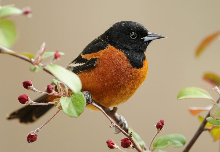
Oddly enough, when the new age of range maps began to dawn, it happened on an empty stretch of country road in eastern Montana. It was early September 2009. Four members of the Cornell Lab of Ornithology’s eBird team—Steve Kelling, Chris Wood, Marshall Iliff, and Brian Sullivan—were out birding. A Barn Swallow dipped over a small stock pond. A pair of Eastern Kingbirds tended a couple of youngsters. In a grove of cottonwoods were a couple of Wilson’s Warblers. All pretty standard stuff. Then an Orchard Oriole appeared that made the group almost giddy.
“We were all jumping up and down, like ‘Oh my god I got Orchard Oriole in September, I can’t believe it!’” recalled Marshall Iliff, who co-leads eBird along with Wood and Sullivan. The bird flew off and the eBirders gave chase, but to no avail. Iliff snagged his pant leg on a barbed-wire fence, and nobody got photo documentation.
As it turned out, that was okay. A little later in the day they saw another, and then another. In eastern Montana, maybe September Orchard Orioles weren’t so rare after all.
Why all the commotion about a bird that, as any field guide can tell you, breeds all over eastern and central North America? The answer is that field guides don’t tell you everything you need to know—at least not yet.
In the Northeast, according to Wood, an Orchard Oriole sticking around until September is about as rare as a European vagrant such as a Curlew Sandpiper or a Ruff. But in the Great Plains, Orchard Orioles seem to migrate on a different schedule. Suddenly, the realization that they hadn’t found a rarity that morning was more exciting than the thrill of thinking they had.
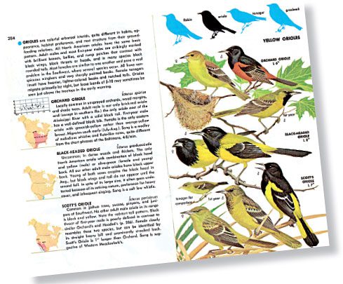
Possibly the only thing more exciting would be the prospect of a field guide that could illustrate these kinds of subtle patterns for anyone to discover. But how? You can cover up the range maps in most guides with a decent-sized postage stamp. The maps are drawn in about five colors, and they can’t easily show when migration happens, let alone where the variations are.
At least, that’s what we expect from a field guide. But just in the last few years, research by the Cornell Lab’s Information Science team has changed almost everything about what a range map can be. And they didn’t even do it with birders in mind. It was an offshoot of a project to help conservation scientists understand at a fine scale where birds occur across an entire continent.
The team was part of the first wave of ecologists to begin working in the realm of Big Data, using supercomputers to churn through mountains of eBird reports. Their work was funded by the National Science Foundation, augmented by data from NASA, and published in journals such as Artificial Intelligence Magazine. Their analyses ate up 2.5 million hours of processor time and returned more raw results than the Lab’s computers could hold.
“It’s really changed the way I think of range maps,” Iliff says. “They used to be just a boundary around where a species lives. But we’re getting close to the point where we’re actually going to be able to ascribe a probability to every point around the world, on every day of the year, [for every species]. That’s a totally different way of thinking about range maps for me.”
In a happy offshoot of all that advanced analysis, the eBird team has created something of direct, utilitarian benefit to birders at large. In the coming years, this new breed of range map is likely to change your experience of going bird watching (especially if you travel). It may even help you with bird identification without ever requiring you to look at a map.
From Ink to Pixels
The very first published range maps were made of words. Even in the early 20th century, when Arthur Bent began his classic series of species accounts, his range maps were sentences. His Orchard Oriole goes like this: “Manitoba and southern Ontario to northern South America.”
A Mesmerizing Migration Map
Actual maps began to appear in North American guides only in 1949, with the first Golden Guide. Bird watchers quickly saw their usefulness for narrowing down identifications, and they became de rigueur in modern field guides.
Range maps are still made of ink and paper today. They are typically the work of a single expert, who draws them by hand using a combination of personal experience, data from journals and breeding bird atlases, and word of mouth.
This approach has its advantages—the human brain is supremely good at collating information, making decisions, and extracting patterns. But a hand-drawn map also has weaknesses. Pull out a magnifying glass to look at your hometown, and you’re still just looking at a blush of color on a piece of paper. It still says only that the bird either should or shouldn’t occur in your general area. And at heart, it’s still a judgment call. If you want to know why, you’ll need to call up the expert and ask.
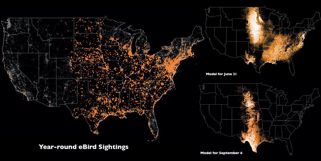
Tomorrow’s maps will be made of pixels and data. Already, 55 prototypes are viewable at eBird; more are coming. Each point of color on the map is there to represent a specific probability of occurrence, and each represents just the tip of a pyramid of data lying underneath the map. If a conservation scientist wants to know why any part of the map looks the way it does, he or she can look into the data and figure it out.
Because the new range maps exist as data, they even have the potential to do their work invisibly. The Cornell Lab’s free Merlin Bird ID app uses a birder’s location and the date to automatically tailor its ID suggestions to the most likely species—doing just what bird-walk leaders have been suggesting for decades. (The app still allows you to pull up maps for each species, too.)
Eventually, range maps will allow you to zoom in to see local features or zoom out to see an entire hemisphere. You’ll be able to filter them, or drill down to see individual checklists, or look at photos uploaded by birders. They’ll show the movements of birds—migration and postbreeding dispersal—not with static color but with movement. Range maps will finally come to life, like the portraits on the walls in a Harry Potter novel.
Ninety-Seven Percent of the World’s Species
“The only way you can conserve biodiversity is knowing where species occur,” is how Steve Kelling explains why he’s interested in making range maps. Kelling directs the Lab’s Information Science program and has shepherded eBird from its beginnings in 1997 to the global database that now provides the raw material for the new range maps.
When eBird launched, in 2002, it grew slowly at first, and then exponentially. It helped that the program had been designed to appeal to birders’ inherent love of keeping lists. Birders can enter reports from anywhere and at any time of the year. Participating is free, instantly accessible on the web (and on smartphone apps), and the program is filled with tools that let birders explore and share what they and others have contributed.
It took 10 years for eBird to get its first 100 million observations; it took 2 years to get the second 100 million. By 2014, eBirders had spent a collective 1,700 years watching birds, and had reported more than 10,000 of the world’s roughly 10,300 species. It’s now one of the world’s largest collections of ecological data—meaning bird watchers are among the most sophisticated sensors of planetary health that the world has ever produced. Paul Lehman has a few qualms about all those data, and he’s not alone. For the past two decades, Lehman has drawn the range maps for most of the North American field guides. (He likes to joke that he owes the Eurasian Collared-Dove and its prolonged range expansion for keeping him in business.)
“Birders get tripped up as often by not appreciating status and distribution as by the field marks that they learn in a field guide,” Lehman says. That’s an argument for studying your field guide, but it’s also a concern about using birders’ sightings to generate range maps, he says.
“If you were to go to Plum Island [Massachusetts] this weekend and ask everyone to send you their eBird checklist,” Lehman says, “how many people would even be close to each other on [counts of ] Herring Gull, Semipalmated Sandpiper, or all the Yellow-rumped Warblers in the myrtle thickets? Somebody with good ears, how many creepers and kinglets will they record versus somebody with poor ears?”
Questions about data quality are among the most frequent that the eBird team hears. The prospect of individual data points being inaccurate just gives people the heebie-jeebies. Fortunately, the maps are much more than a raw compilation of eBird sightings.
Without models, eBird data would produce maps made up of thousands of little dots clustered around where people live and where they go birding. If you see a group of American Goldfinches in the trees behind your house, but you don’t look in the trees in your neighbor’s yard, does that mean they aren’t there? To go from data points to a smooth range map, you need a model.
“No matter how much data you collect,” Kelling says, “we’re never going to count all the birds, and we’re always going to have biases to population centers.” In Kelling’s view, the biggest breakthrough in creating the new range maps was not accumulating eBird’s mountain of data, it was figuring out how to model it.
For this, a statistician on the eBird team named Daniel Fink invented something called a STEM model, or “spatiotemporal exploratory model.” He takes eBird’s millions of observations and associates them with other big datasets on climatic variables, ecological conditions, and human factors.
“Some of the raw data [that are available] are pretty mindblowing,” Fink says. “Satellites are going around the earth every couple of days, and you can sort of Lego it all together.” His models correlate these environmental variables with where sightings have occurred—and, crucially, where sightings haven’t occurred as well (see “Solving the Area 51 Effect,” at left). Then the models look for other parts of the landscape that match those variables. If the match is close enough, the model includes it as part of the range map.
Of course there’s a catch. Birds often change where they live in different seasons or parts of their range. Tree Swallows winter in wooded wetlands in the South, but not in frozen Michigan and Wisconsin. Indigo Buntings look for insects along forest edges in early summer, but by late summer they’re in fields eating seeds. How is a computer model to know?
Fink solved the problem with what he calls a “slice-and-dice” approach. He chops the United States up into about 100 smaller regions. For each one, he runs up to 200 models looking for correlations between bird detections and environmental variables. The models find correlations that are valid for that area and time of year, but the analysis prevents them from extrapolating further.
Fink averages those 200 model results to get a single probability for a certain area at a certain week of the year. That number becomes a pixel of color on the map. To get the next pixel, he runs all those models again. Then he does it all again for the next week of the year. And all of that again for the next species of bird. That’s what fills up 2.5 million hours on a supercomputer.
The Orchard Oriole Harry Potter Range Map
A couple of years after that morning in Montana, the same four birders gathered around a computer monitor along with Fink to look at the new maps. The picture—a map of the continental United States—started quiet and black, showing January, when all the Orchard Orioles were in Central America. Then the map began to tick through the year. Spring arrived with a flash of orange up the Mississippi and across the East. A brief moment of stillness indicated birds settling down for the breeding season. By late summer the color had drained out of the Northeast, leaving an orange glow of orioles across the Great Plains into September.
“That was the first point where you could see the division in timing,” Wood said, “that suggested there were these two different populations of Orchard Orioles that nobody that we know of had ever really understood before.”
The map had communicated in just a few seconds what few birders had ever put together. In the history of discoveries it was a small one, but one of hundreds now being made visible.
Take the Eastern Phoebe. “You could go to [regional books on] birds of Florida, Georgia, Texas, Colorado, and get a feel for the migration of Eastern Phoebes,” Iliff says. “But suddenly with a STEM map you’re piecing things together in a way that no one ever has before.”
Same with Yellow Warbler. “Someone like Paul Lehman might be able to tell you that Yellow Warblers in the West arrive earlier than ones in the East, but when you see that on a map it’s like a month-and-a-half difference,” Iliff says. “In my mind there’s no birder in the country who can understand some of the big-scale differences with migration phenology like you can when you see it on a map.”
Pretty, Powerful
As pretty and as helpful for birders as they are, the really meaningful advance of STEM maps is how they signal the arrival of Big Data–type analyses to the fields of conservation and basic ornithology.
“Every time you look at one of these heat maps, you come away with a question,” Kelling told me, and those lead to new hypotheses and new avenues of research. “So our goal is just to crank these [models] out annually—hundreds of them. And then researchers…can look at that data and start generating and testing hypotheses.”
Scientists working on the State of the Birds Report in 2011 and 2013 did just that. For 350 species, they determined how much of each species’ range is owned by a variety of public and private landowners. For the first time, land managers had a specific, personalized picture of which species were most important for them to pay attention to.
Maps of ranges are one thing, but how do you know where a species’ strongholds are? By modeling abundance, rather than simple occurrence. That was the goal of a postdoctoral associate named Alison Johnston, in 2013. Her models allowed The Nature Conservancy to set up temporary wetlands in California for some 200,000 migrating shorebirds (see “Moneyball for Shorebirds,” Autumn 2014).
Someday, she says, a birder might be able to ask a computer, “Which three places can I go today to see the most numbers or species of birds?” Likewise, a conservationist would be able to ask, “If I have enough money to create three land reserves, where could I put them to protect the most birds?”
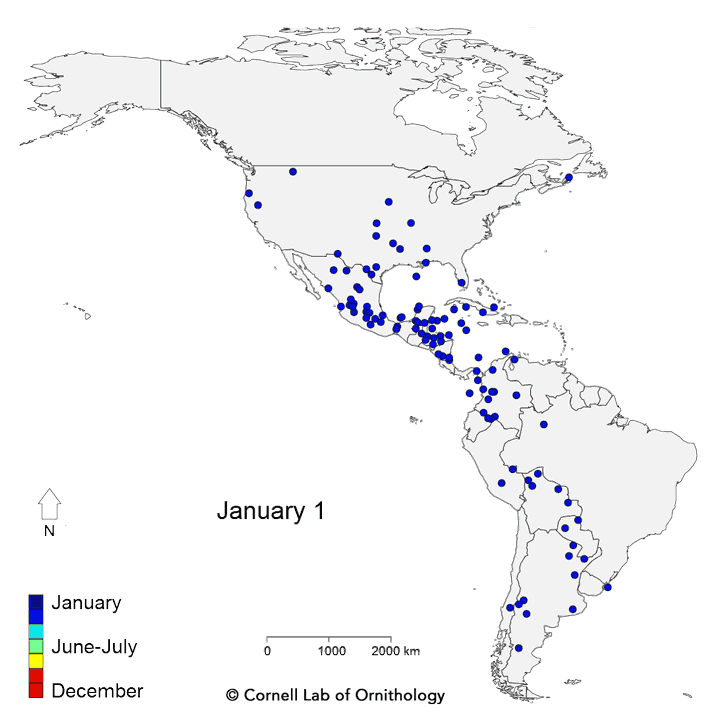
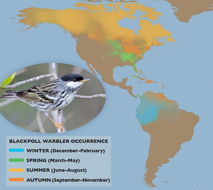
The range maps started off with U.S. birds because that’s where eBird has the most data. But global participation is growing, and Kelling has his sights on creating year-round maps for all 800 North American species across the entire Western Hemisphere. (They’ve already made them for a few species, including Barn Swallow, Black-throated Blue Warbler, and Blackpoll Warbler.) To do this, Fink had to make another advance in STEM models: giving them the ability to adjust their resolution depending on how much data are available.
These improvements will circle back to birders in the same way the initial maps did. Imagine a birding trip to Peru, where 1,800 species vie for your attention. “As good as that bird guide is,” says Iliff, “it’s got almost 2,000 species in it. Nobody can absorb that in studying for a trip.”
In five years, Wood says, maybe there’ll be a Merlin-like app that uses STEM-generated ranges to help you understand which species are in the running. It’s the thing that bird watchers and their field guides have been pursuing for decades: tools that don’t necessarily do the identification for you, but narrow down the possibilities and give you a place to start. The more data that pour into eBird (currently at the rate of several million observations per month), the more accurate the models will get. There’s just one catch, and it’s also the data. In the time since the first STEM models were run, the amount of data in eBird has doubled. The prospect of newly calculated models is enough to make a statistician salivate. But first they’re going to need a few million more hours on a supercomputer.
All About Birds
is a free resource
Available for everyone,
funded by donors like you
American Kestrel by Blair Dudeck / Macaulay Library